Thursday, November 8, 2012
SharePoint Foundation 2013 RTM and the 401 Unauthorized error
Tuesday, August 21, 2012
Custom Callouts in the SharePoint 2013 Metro UI, Part 3: the CalloutManager
Previous: Custom Callouts in the SharePoint 2013 Metro UI, Part 2: Actions
Back to contents.
CalloutManager allows to get or create an instance of the callout and manage its state.
How to Get a Callout
If you need to manage already created callout you have to get a reference to the desired instance. The CalloutManager has several methods to do it.
getFromLaunchPoint
This method allows to get an instance of the callout from its launch point. The only argument is the DOM element that is used as a launch point for the desired callout:// choose the launch point HTML element
var launchPoint = document.getElementById('calloutDiv');
// get the callout
var callout = CalloutManager.getFromLaunchPoint(launchPoint);If there's no defined callout for the specified launch point the error will be raised.
getFromLaunchPointIfExists
It's the variation of the getFromLaunchPoint (see above) method. The only difference is that there will be no error if the callout isn't founded. In that case the method simply returns null. it allows to check for the existence of the callout instance silently.
// get the callout
var callout = CalloutManager.getFromLaunchPointIfExists(launchPoint);
if (callout == null)
{
   // create
}
getFromCalloutDescendant
This method allows to get a callout instance from the DOM element located inside it's structure. It allows for example to get the callout from its content. The only argument is the DOM element. If the chosen DOM element is not inside the callout or the callout is not found for the some reason the error will be raised.
// choose the descendant HTML element
var descendant = document.getElementById('descendantDiv');

// get the callount
var callout = CalloutManager.getFromCalloutDescendant(descendant);
How to Create a Callout
There are two methods to create a callout. Both methods accept a callout creation options object and return the created callout instance. For the details of the creation see the first article of the series.
createNew
The method createNew which allows to create a callout is described in the first part of this series.
createNewIfNecessary
The method createNewIfNecessary is almost identical to the createNew but creates the callout only if there's no callout for the target launch point already. If there's a callout it will be returned instead of the creation of the new one.
var callout = CalloutManager.createNewIfNecessary(calloutOptions);How to Remove a Callout
If you need to remove the callout you need to pass it to the remove method of the CalloutManager:
// get the callout
var launchPoint = document.getElementById('calloutDiv');
var callout = CalloutManager.getFromLaunchPoint(launchPoint);
// remove
CalloutManager.remove(callout);
How to Enumerate All Callouts
If you need to get all the defined callouts you can use the forEach method of the CalloutManager:
// close all the callouts on the page
CalloutManager.forEach(function(callout) {
   // close the current callout
   callout.close();
   }
});
You have to specify a function to apply for each callout. The only argument of this function is the callout instance currently being processed.
How to Close All Opened Callouts
The previous section shows how you can close all the callouts enumerating them by forEach method. But for this particular task the CalloutManager has the helper shortcut function - closeAll:
// close all the callouts;
var isAtLeastOneCalloutClosed = CalloutManager.closeAll();
This function return true if at least one callout was closed.
Previous: Custom Callouts in the SharePoint 2013 Metro UI, Part 2: Actions
Back to contents.
Thursday, August 2, 2012
Custom Callouts in the SharePoint 2013 Metro UI, Part 2: Actions
Previous: Custom Callouts in the SharePoint 2013 Metro UI, Part 1: Basics
Next: Custom Callouts in the SharePoint 2013 Metro UI, Part 3: CalloutManager
As we can see from the previous part of this series, you can define a set of menu items in your custom callout. These items are called actions.
To define a simple action, you need to:
- Configure action creation options
- Create an action instance
- Add the created instance to the callout
Configure action creation options
Action creation options are being configured via CalloutActionOptions object.
// configure callout action options
var actionOptions = new CalloutActionOptions();
actionOptions.text = 'Action 1';
actionOptions.onClickCallback = function(event, action)
{
    // do some work
};
And here’s the result (for the callout creation see the previous article):

Here we’ve defined the required minimum of options – the text and the click event handler.
text
The text is required option. It’s a string.
onClickCallback
It’s the function that handles the action click event. It is required if your action is simple and it doesn’t have any menu items (see below for the menu action details). This function receives two arguments. First argument is the standard HTML DOM event caused by the click on the action. The second parameter is the action itself:
actionOptions.onClickCallback = function(evt, action)
{
    // get the event data
    alert(evt.clientX + ' ' + evt.clientY);

    // get the action text
    alert(action.getText());
};
Create an action instance
To create an action instance you need to pass the prepared action options to the Action instance constructor:
// create an action
var calloutAction = new CalloutAction(actionOptions);
Add the action to the callout
The last requirement is to add the created action to the callout’s actions collection:
// add the action to the callout
callout.addAction(calloutAction);
Additional action options
In addition to the required options for the action you can configure some additional but not required details.
tooltip
It defines the standard browser tooltip for the action which shows on the mouse over.
actionOptions.tooltip= 'Action 1 tooltip';disabledTooltip
It’s the tooltip for the disabled state – it allows providing the information concerning the inaccessibility of your option.
actionOptions.disabledTooltip = 'Action 1 disabled tooltip';isEnabledCallback
And here’s the way to rule the availability of your option:
actionOptions.isEnabledCallback = function (action)
{
    // get the action text
    alert(action.getText());

    // set our action as enabled
    return true;
};
isVisibleCallback
This function helps to define the visibility of the action. It work exactly the same as the isEnabledCallback (see above) in any detail:
actionOptions.isVisibleCallback = function (action)
{
    // get the action text
    alert(action.getText());

    // set our action as visible
    return true;
};
Actions with the dropdown menu
The last but not least option for the action configuration is the menuEntries property of the CalloutActionOptions object. It helps to define a special kind of the action – the one with the dropdown menu of options instead of a simple text. It allows combining several actions in the related and compact groups in order to save space, providing some logical structure for the actions list and adhering to the SharePoint Metro UI design principles.
If there are any items in the menuEntries, the action becomes a dropdown menu. In that case you can’t set the action’s onClickCallback handler because the action no more responsible for any real work and only expands its dropdown menu on click event.
menuEntries is just a standard JavaScript array containing CalloutActionMenuEntry instances. Each element corrensponds to a single menu item. Here’s the initialization example:
var menuEntries = new Array();
var menuEntry1 = new CalloutActionMenuEntry('Subaction 1', function (action, selectedEntryIndex)
{
    // Get the selected menu entry from the parent action
    var selectedEntry = action.getMenuEntries()[selectedEntryIndex];
    alert(selectedEntry.text);
});
menuEntries.push(menuEntry1);
var menuEntry2 = new CalloutActionMenuEntry('Subaction 2', function (action, selectedEntryIndex)
{
});
menuEntries.push(menuEntry2);
var menuActionOptions = new CalloutActionOptions();
menuActionOptions.text = 'Menu action';
menuActionOptions.menuEntries = menuEntries;
var menuAction = new CalloutAction(menuActionOptions);
callout.addAction(menuAction);
It’s the result:

If you click this action the dropdown will be opened:

The minimal parameters for each action menu entry are the text and the onClickCallback function. It’s not practical anyway but if you don’t provide them the whole action will not be shown and the error will be raised.
text
It’s the text of the menu entry.
onClickCallback
It’s the handler function for the menu entry click event. This function receives two arguments. First argument is the parent action of the clicked menu entry and the second one is the zero based index of the entry itself inside menuEntries array. The combination of these parameters allows getting the clicked entry:
var menuEntry1 = new CalloutActionMenuEntry('Subaction 1', function (action, selectedEntryIndex)
{
    // Get the selected menu entry from the parent action
    var selectedEntry = action.getMenuEntries()[selectedEntryIndex];
    alert(selectedEntry.text);
});
For the menu action the text option of the CalloutActionOptions is not required. If it doesn’t defined there will be ellipsis image drawn instead of the text:

The common design is to have a single menu at the end of the row but there are no restrictions on the menu position and quantity of menus inside the actions row. You can create multiple menus but I think it doesn’t adhere to the SharePoint Metro UI design.
Unresolved questions
There are some questions that need to be resolved still.
The CalloutActionMenuEntry class accepts four additional parameters: image url, image alt text, “sequence” and “description”. They all results in some HTML markup inside the generated menu item but it is unclear how they are used. For example, if you provide the image url correspondinf image will be rendered in menu item HTML but will be hidden.
There are some out-of-the-box callouts with additional customizations of action dropdown menu. For example, here are the separators:

Previous: Custom Callouts in the SharePoint 2013 Metro UI, Part 1: Basics
Next: Custom Callouts in the SharePoint 2013 Metro UI, Part 3: CalloutManager
Friday, July 27, 2012
Custom Callouts in the SharePoint 2013 Metro UI, Part 1: Basics
Next: Custom Callouts in the SharePoint 2013 Metro UI, Part 2: Actions
Back to contents.
A concept of callouts in SharePoint 2013 Metro UI
SharePoint 2013 introduces a Metro-style approach to the UI design. One of the new concepts there are the callouts. Here’s the definition from the ‘Apps for SharePoint UX design guidelines’ article:
These provide relevant contextual information and actions around a particular item. Callouts are generally used to show the user more information or actions about an item in a lightweight UI.Let’s look at some examples. Here’s the additional info for the document inside the document library:


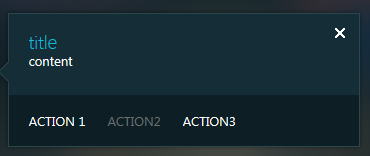
The callout structure
Let’s examine the structure of the callout UI.
title
It’s a little area at the top of the callout. The title isn’t required – there will be no such area if you don’t set its value.content
It’s the main information area of the callout. .close button
It’s the one of the ways to close the opened callout. The callout may be closed by:- the mouse click on the close button
- the mouse click on the area outside the callout
- by the ESC button
commands area
There can be a commands area at the bottom of the callout. It contains a menu with one or several actions. If there are no commands the corresponding area will not be shown.beak
It’s a small arrow-like element visually connecting the callout with its source. It can be placed on top/bottom or the left/right side of the callout according to the chosen callout positioning scheme.SharePoint 2013 callouts framework
If you want to employ this concept in your custom solution (app or webpart etc) to provide design consistency with the SharePoint UI you can create custom callouts. There’s a special “framework” to create and show callouts in the SharePoint 2013. As the dialogs framework known from the SharePoint 2010 the callouts framework resides in the out-of-the-box javascript files in the LAYOUTS folder. The main part of the framework is defined in the callout.js file.How to create a callout
In order to use the callout you have to create it. Note thet the creation of the callout is not the same as the opening – callout is created once and then can be opened/closed many times.To create a callout you need:
- Choose the HTML element in your UI that will be the source for callout positioning and for events (click or hover) to open the callout. It’s called the “launch point” in the callouts framework terminology.
- Configure the options for your callout
- Call the CalloutManager to create the callout
The launch point
Every callout need the so called “launch point”. It’s an HTML element which will be the source for positioning and opening events for the callout. If you choose the click event to open callout then the click on the launch point element will trigger the opening of the callout.There can be only one callout associated with the specific launch point element at any given time. If you’ll try to create another callout for the same launch point there will be an error. If you need to create new callout for the launch point you have to remove the old ones first.
// choose the launch point HTML element
var launchPoint = document.getElementById('calloutDiv');
Callout options
To specify the callout parameters you need to configure an instance of the CalloutOptions class. It’s required by the CalloutManager while creating the callout.
// configure options
var calloutOptions = new CalloutOptions();
calloutOptions.ID = 'calloutID';
calloutOptions.launchPoint = launchPoint;
calloutOptions.beakOrientation = 'leftRight';
calloutOptions.content = 'content';
calloutOptions.title = 'title';
Call the CalloutManager
When you have the launch point and the callout options prepared you need to call the CalloutManager.createNew method to create and obtain the callout instance. CalloutManager is the kind of singleton used to manage callouts life cycle – to create, obtain, use and destroy callouts instances.
// call the CalloutManager to create the callout
var callout = CalloutManager.createNew(calloutOptions);
Here’s the result – the created callout is shown on click to launch point div:

To be continued
It's only the start of my research of the callouts framework. In the next articles we'll explore how to:- create actions
- manage already created callouts
- configure all the available callout options
- open callouts configured to open programmatically (without hover or click event)
- and more...
Stay tuned and feel free to comment, correct or share this article. You can reach me here or at mail@alexboev.com
Next: Custom Callouts in the SharePoint 2013 Metro UI, Part 2: Actions
Back to contents.
Saturday, January 21, 2012
The Browse Tab In SharePoint 2010 Ribbon
Back to the contents of the series.
This post is a part of the upcoming series about SharePoint 2010 and related technologies. I'm an enthusiast of SharePoint platform (especially of 2010 version) and I like very much to explain things I know to others. These articles is my attempt to systematize my own knowledge of platform and to help others to understand it. I'd like to hear from you if there are any mistakes or things on the subject of the given article that are not covered. You can write your comments here or on my email - mail@alexboev.com.
I will update any article as my knowledge will improve. And sorry for my English - it's not quite good now but I'm learning. :) Fill free to point me on any mistakes.
While viewing CMDUI.XML file you can find a tab with "Ribbon.Read" identidier and with empty scaling and groups sections:
<Tab Id="Ribbon.Read" Sequence="100" Command="ReadTab" Description="" Title="$Resources:core,TabRead;" CssClass="ms-browseTab">
   <Scaling Id="Ribbon.Read.Scaling">
   </Scaling>
   <Groups Id="Ribbon.Read.Groups">
   </Groups>
</Tab>