Previous: Custom Callouts in the SharePoint 2013 Metro UI, Part 1: Basics
Next: Custom Callouts in the SharePoint 2013 Metro UI, Part 3: CalloutManager
As we can see from the previous part of this series, you can define a set of menu items in your custom callout. These items are called actions.
To define a simple action, you need to:
- Configure action creation options
- Create an action instance
- Add the created instance to the callout
Configure action creation options
Action creation options are being configured via CalloutActionOptions object.
// configure callout action options
var actionOptions = new CalloutActionOptions();
actionOptions.text = 'Action 1';
actionOptions.onClickCallback = function(event, action)
{
    // do some work
};
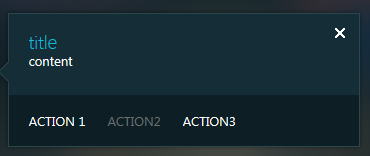
And here’s the result (for the callout creation see the previous article):

Here we’ve defined the required minimum of options – the text and the click event handler.
text
The text is required option. It’s a string.
onClickCallback
It’s the function that handles the action click event. It is required if your action is simple and it doesn’t have any menu items (see below for the menu action details). This function receives two arguments. First argument is the standard HTML DOM event caused by the click on the action. The second parameter is the action itself:
actionOptions.onClickCallback = function(evt, action)
{
    // get the event data
    alert(evt.clientX + ' ' + evt.clientY);

    // get the action text
    alert(action.getText());
};
Create an action instance
To create an action instance you need to pass the prepared action options to the Action instance constructor:
// create an action
var calloutAction = new CalloutAction(actionOptions);
Add the action to the callout
The last requirement is to add the created action to the callout’s actions collection:
// add the action to the callout
callout.addAction(calloutAction);
Additional action options
In addition to the required options for the action you can configure some additional but not required details.
tooltip
It defines the standard browser tooltip for the action which shows on the mouse over.
actionOptions.tooltip= 'Action 1 tooltip';disabledTooltip
It’s the tooltip for the disabled state – it allows providing the information concerning the inaccessibility of your option.
actionOptions.disabledTooltip = 'Action 1 disabled tooltip';isEnabledCallback
And here’s the way to rule the availability of your option:
actionOptions.isEnabledCallback = function (action)
{
    // get the action text
    alert(action.getText());

    // set our action as enabled
    return true;
};
isVisibleCallback
This function helps to define the visibility of the action. It work exactly the same as the isEnabledCallback (see above) in any detail:
actionOptions.isVisibleCallback = function (action)
{
    // get the action text
    alert(action.getText());

    // set our action as visible
    return true;
};
Actions with the dropdown menu
The last but not least option for the action configuration is the menuEntries property of the CalloutActionOptions object. It helps to define a special kind of the action – the one with the dropdown menu of options instead of a simple text. It allows combining several actions in the related and compact groups in order to save space, providing some logical structure for the actions list and adhering to the SharePoint Metro UI design principles.
If there are any items in the menuEntries, the action becomes a dropdown menu. In that case you can’t set the action’s onClickCallback handler because the action no more responsible for any real work and only expands its dropdown menu on click event.
menuEntries is just a standard JavaScript array containing CalloutActionMenuEntry instances. Each element corrensponds to a single menu item. Here’s the initialization example:
var menuEntries = new Array();
var menuEntry1 = new CalloutActionMenuEntry('Subaction 1', function (action, selectedEntryIndex)
{
    // Get the selected menu entry from the parent action
    var selectedEntry = action.getMenuEntries()[selectedEntryIndex];
    alert(selectedEntry.text);
});
menuEntries.push(menuEntry1);
var menuEntry2 = new CalloutActionMenuEntry('Subaction 2', function (action, selectedEntryIndex)
{
});
menuEntries.push(menuEntry2);
var menuActionOptions = new CalloutActionOptions();
menuActionOptions.text = 'Menu action';
menuActionOptions.menuEntries = menuEntries;
var menuAction = new CalloutAction(menuActionOptions);
callout.addAction(menuAction);
It’s the result:

If you click this action the dropdown will be opened:

The minimal parameters for each action menu entry are the text and the onClickCallback function. It’s not practical anyway but if you don’t provide them the whole action will not be shown and the error will be raised.
text
It’s the text of the menu entry.
onClickCallback
It’s the handler function for the menu entry click event. This function receives two arguments. First argument is the parent action of the clicked menu entry and the second one is the zero based index of the entry itself inside menuEntries array. The combination of these parameters allows getting the clicked entry:
var menuEntry1 = new CalloutActionMenuEntry('Subaction 1', function (action, selectedEntryIndex)
{
    // Get the selected menu entry from the parent action
    var selectedEntry = action.getMenuEntries()[selectedEntryIndex];
    alert(selectedEntry.text);
});
For the menu action the text option of the CalloutActionOptions is not required. If it doesn’t defined there will be ellipsis image drawn instead of the text:

The common design is to have a single menu at the end of the row but there are no restrictions on the menu position and quantity of menus inside the actions row. You can create multiple menus but I think it doesn’t adhere to the SharePoint Metro UI design.
Unresolved questions
There are some questions that need to be resolved still.
The CalloutActionMenuEntry class accepts four additional parameters: image url, image alt text, “sequence” and “description”. They all results in some HTML markup inside the generated menu item but it is unclear how they are used. For example, if you provide the image url correspondinf image will be rendered in menu item HTML but will be hidden.
There are some out-of-the-box callouts with additional customizations of action dropdown menu. For example, here are the separators:

Previous: Custom Callouts in the SharePoint 2013 Metro UI, Part 1: Basics
Next: Custom Callouts in the SharePoint 2013 Metro UI, Part 3: CalloutManager
louis vuitton handbags
ReplyDeletecheap soccer jerseys
coach outlet online
giuseppe zanotti shoes
ferragamo outlet
polo ralph lauren
oakley sunglasses wholesale
michael kors factory outlet
polo ralph lauren outlet
tory burch outlet online
chanyuan2017.05.18
very helpful post.
ReplyDeleteCan you please help me in creating custom ECB menu in a html table. All the list data bind to a html table .
oakley sunglasses
ReplyDeletestuart weitzman
new balance
beats by dre
polo ralph lauren
bottega
miu miu shoes
jordan
sac burberry
jordan xx9
2018.5.9xukaimin
oakley sunglasses cheap
ReplyDeletenike revolution
jordan shoes
longchamp outlet
jordan 5
nike shoes for women
running shoes
nike outlet online
michael kors outlet clearance
dolce & gabbana
chenyingying20180622
nike shoes
ReplyDeletelouboutin outlet
michael kors
guess
herve leger dresses
timberland pas cher
converse all stars
true religion outlet
nike outlet
ralph lauren outlet
2018.7.10xukaimin
bally
ReplyDeletemontre
nike roshe run
jordan
moncler jackets
true religion jeans
ferragamo belt
chloe handbags
dior handbags
jerseys
2018.9.15chenlixiang
longchamp outlet
ReplyDeleteair jordan
off-white
ggdb
kevin durant shoes
a bathing ape
curry 5 shoes
lebron shoes
birkin bag
pandora jewelry official site
go to this site hop over to here click find out see great post to read
ReplyDeleteGamblers Anonymous , or other 12-step packages, may also help you overcome 카지노 사이트 your gambling addiction. This sort of program could also be} especially helpful when you can’t afford extra intensive rehabilitation options. It follows the same mannequin as Alcoholics Anonymous, serving to you construct a help network of other recovered gambling addicts.
ReplyDeleteInvestigators https://casino.edu.kg/%EC%86%8C%EC%9A%B8%EC%B9%B4%EC%A7%80%EB%85%B8.html on the Manhattan district attorney’s office seized the cellphone of Department of Buildings Commissioner Eric Ulrich and questioned him in reference to an unlawful gambling probe, according to stories from the New York Times and the Daily News. Language-learning company Duolingo officially launched its math app to common public} this week, following beta trials. The app represents the primary expansion past language studying and literacy for the company. The app allows users determine on} between an elementary version that focuses on fundamental ideas like multiplication and division and an adult version that’s extra optimized for “brain training” workouts that put expertise into follow.
ReplyDeleteGreat rreading
ReplyDeleteWell, today, on the eve of the Monaco Grand Prix, TAG Heuer is bringing the Dark Lord back to life. The general aesthetic is revised with this new link watch, touted as a Monaco Special Edition for the Formula 1 Monaco Grand Prix. I think I'll stick with Dark Lord Revival if it's all the same. link
ReplyDelete